I obtained an original postscript file from AUTO using Plaut, and then edited the text of the postscript file to improve the quality. There may well be an alternative WYSIWYG approach, using some kind of point-and-click picture editor (WYSIWYG stands for "what you see is what you get"), but the method described here ensures that all diagrams get converted in exactly the same way, and makes clear how to add your own refinements. The edits may appear lengthy, but only take a few minutes to do to a postscript file.
Figure 1 shows an original postscript file obtained via Plaut, and Figure 2 shows the bolder version, with larger characters. Unfortunately, to show the figures on a WWW page I had to convert them both into .gif files, and the difference in quality (in particular the boldness of the lines) is not too apparent. To download a postscript file (only 231 kilobytes) that more clearly shows the difference click here.
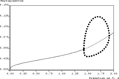
Figure 1. Original postscript output derived from Plaut. Diagram shows the variation in phytoplankton concentration as the predation on zooplankton, parameter d, is varied for a nutrient - phytoplankton -zooplankton model (consisting of three coupled ordinary differential equations). Solid lines indicate stable steady states, dashed lines indicate unstable steady states, solid circles indicate the maximum and minimum phytoplankton concentrations reached along limit cycles, and the two squares represent Hopf bifurcations of the steady states.
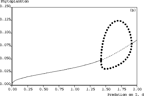
Figure 2. Improved-quality postscript file, with bolder lines and larger fonts. The difference in quality is not too clearly seen, since both pictures have been converted into .gif format for this WWW page. Download this postscript file to see the contrast between the figures more clearly. This is Figure 3(b) in Edwards and Brindley (1996)
If, after reading this article, you wish to use it to improve your own postscript files, the easiest thing to do would be to save this page as a Text file (not as source code), and then cut and paste the relevant sections from the tables into your postscript file.
Firstly, a brief description of how I obtained Figure 1. I used the 1994 version of AUTO, and created the diagram using the built-in package Plaut (activated by typing @p xxx, where xxx corresponds to the name of your system of ODE's). I did not use the Graphical User Interface, since I had already got used to using AUTO before it was implemented (and for some quirky reason it only seemed to work on our computers on Thursdays). In Plaut I used the following options (a full list of commands appears in the AUTO97 manual):
tek2ps filename.tek > filename.psNote that to show Figure 1 on a WWW page I had to unrotate, translate and rescale it - this involved removing the relevant parts from the /NP section of the postscript file (see table), and changing .1730769 .17626953 scale to 0.13 0.13 scale, and then cropping and saving as a .gif file using xv.
Now, to obtain the bolder lines and larger font, and to then insert into LaTeX, I did the steps in the following table. You have to edit the source code of the filename.ps file, by using an editor such as textedit, vi, emacs, etc. I figured out what to do by playing around with the code, and viewing the diagrams using ghostview. Note that at the given scale, the diagram is too large to fit onto a standard page (A4 or American Letter sizes), but when put into LaTeX the diagram does fit. Just change the numbers preceding scale to make the diagram smaller.
| Line number or section | Change or remove | Replace with | Comments |
|---|---|---|---|
| 3 | @(#)pstek.pro 1.10 | Remove | This may not appear on all versions |
| 9 | %%BoundingBox: 40 40 540 540 |
%%BoundingBox: 35 0 740 540 |
May want to change numbers if not going to use LaTeX |
| 13 | /FntH .... 80 .... |
/FntH .... 100 .... |
Increases font size |
| /NP | 572 40 translate % leave a border 90 rotate % .71707 .692308 scale % 0-1023X, 0-780Y |
Remove - but don't remove the { bracket | Keep translate and change the numbers if not going to use LaTeX |
| /DP | /DP % tsizey -> - erase and home
{ clippath 1 setgray fill
0 setgray
0 exch moveto
} def
|
Remove whole section | - |
| - | Find stroke and replace with ST throughout whole document, but not if /ST section already exists before FntH | - | Use an automatic `Find and Replace' command - there are lots of strokes! |
Before FntH setfont |
Add the following:
/ST	% stroke, with wider line
{	4 setlinewidth
	1 setlinecap
	1 setlinejoin
	stroke
} def |
- | I think that the default is 2 setlinewidth , and so 4 makes the lines twice as thick. If /ST already appears, just change the setlinewidth to 4. |
| NP | Remove
0 3068 moveto 89 DP |
- | - |
| NP - 5th and 8th lines | 540 .... | 550 .... | - |
| After the x-axis name, the y-axis name and x-axis numbers, come the y-axis numbers. | For the second and subsequent y-axis numbers, change each 540 in 540 ... moveto |
Change each 540 to 550 to give 550 ... moveto |
This stops the tick-marks from overlapping with the y-axis numbers (which are larger because of the increased font-size) and may not be needed |
| In order to ... | `Simply' .... |
|---|---|
| Put the (b) in Figure 2 in the top right-hand corner | Insert ((b)) 3600 2490 PRabove the moveto preceding the start of the x-axis name. |
| Put the (b) in the top left-hand corner | Insert ((b)) 610 2490 PRabove the moveto preceding the start of the x-axis name. |
| To annotate the graph with Hello Mum | Insert (Hello Mum) 610 2490 PRabove the moveto preceding the start of the x-axis name, changing the co-ordinates as required. |
| Avoid some of the x-axis numbers clashing with the x-axis labels, which happens if the numbers are too large to be plotted along one row, and thus get plotted along two rows | Change each offending 340 to 400 in the locations of the x-axis numbers |
| To use Greek letters | Add /Symbol findfont 100.00 scalefont setfont (a) 1880 1900 PRbefore showpage, which should be at the end of the postscript file. This plots the Greek letter alpha at the location 1880 1900. Change (a) to (b) to give beta, etc. |
All the steps given may not be needed, and this may not be the most efficient method, but it works and so I stuck with it. Remember to delete filename.tek, and use @cl to delete unwanted AUTO files. Now, to incorporate a diagram into a LaTeX document, use the following in your .tex file. This actually creates a table with two figures, one under the other (which fit well onto one sheet of paper), and works with LaTeX2e. This is what I used to produce the downloadable postscript file mentioned earlier.
\begin{figure}[tbp]
\centering      % or \begin{center} if you don't have \centering
\begin{tabular}{c}
\epsfxsize=130mm
\epsfcbox{pvsdfortex.ps}
\\
\epsfxsize=130mm
\epsfcbox{pvsdbold.ps}
\end{tabular}
\protect \caption{The top figure is the original diagram; the bottom one is ...}
\label{fig:autops}
\end{figure}
If \epsfcbox does not work, I think that all you need to do is add the following to the end of your epsf.sty file (I found this to be missing from our epsf.sty file at Woods Hole):
%
% Additions by B.D. Ripley to support horizontally centered boxes and draft mode
%
\epsffull
\def\drawbox#1#2{\vbox{\hrule\hbox to #2{\vrule height #1\hfil\vrule}\hrule}}
%
\def\epsfcbox#1{\global\def\epsfllx{72}\global\def\epsflly{72}%
   \global\def\epsfurx{540}\global\def\epsfury{720}%
   \def\lbracket{[}\def\testit{#1}\ifx\testit\lbracket
   \let\next=\epsfcgetlitbb\else\let\next=\epsfcnormal\fi\next{#1}}%
%
\def\epsfcnormal#1{\epsfgetbb{#1}\epsfcsetgraph{#1}}%
\def\epsfcsetgraph#1{\centerline{\epsfsetgraph{#1}}}
\def\epsfcgetlitbb#1#2 #3 #4 #5]#6{\epsfgrab #2 #3 #4 #5 .\\%
   \epsfcsetgraph{#6}}%
Please let me know if this is any use, and of any problems that you encounter. I used AUTO to compute one-parameter bifurcation diagrams. To follow Hopf and fold bifurcations as two parameters varied, I used LOCBIF. To produce diagrams from LOCBIF I implemented the graphics package IDL, but that's another story...
Dr. Andrew M. Edwards